Portfolio Site
web design, html/css coding, graphic design
Building a portfolio site was not a linear process. Currently you're looking at the third incarnation, and likely in the future this site will continue evolving. (Such is the nature of iteration, no?)
The Process
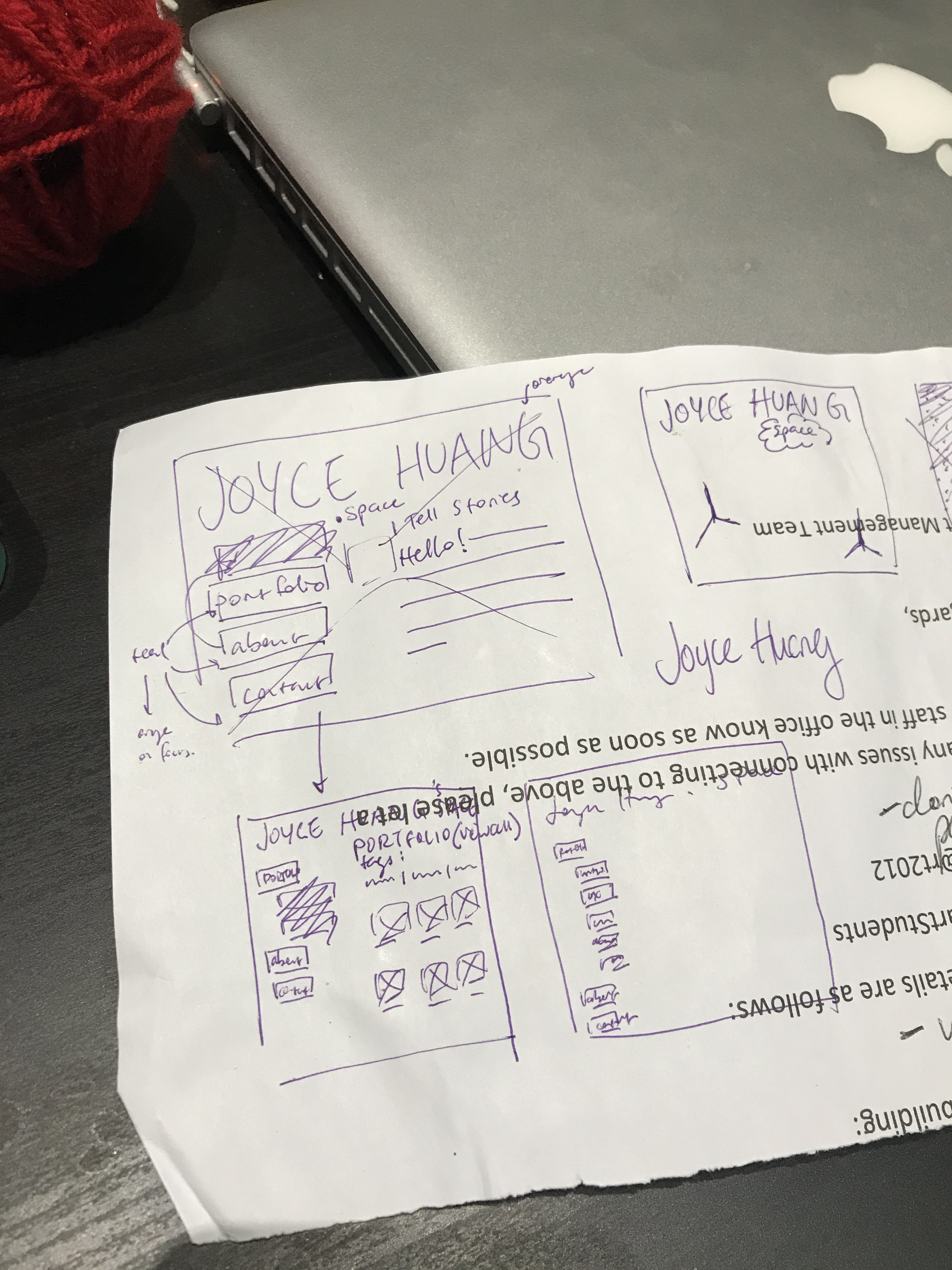
Version 1 was quite bare bones. At the time, I was making a site for my writing projects, so I researched other portfolios that writers and creators had and threw together a very basic website.
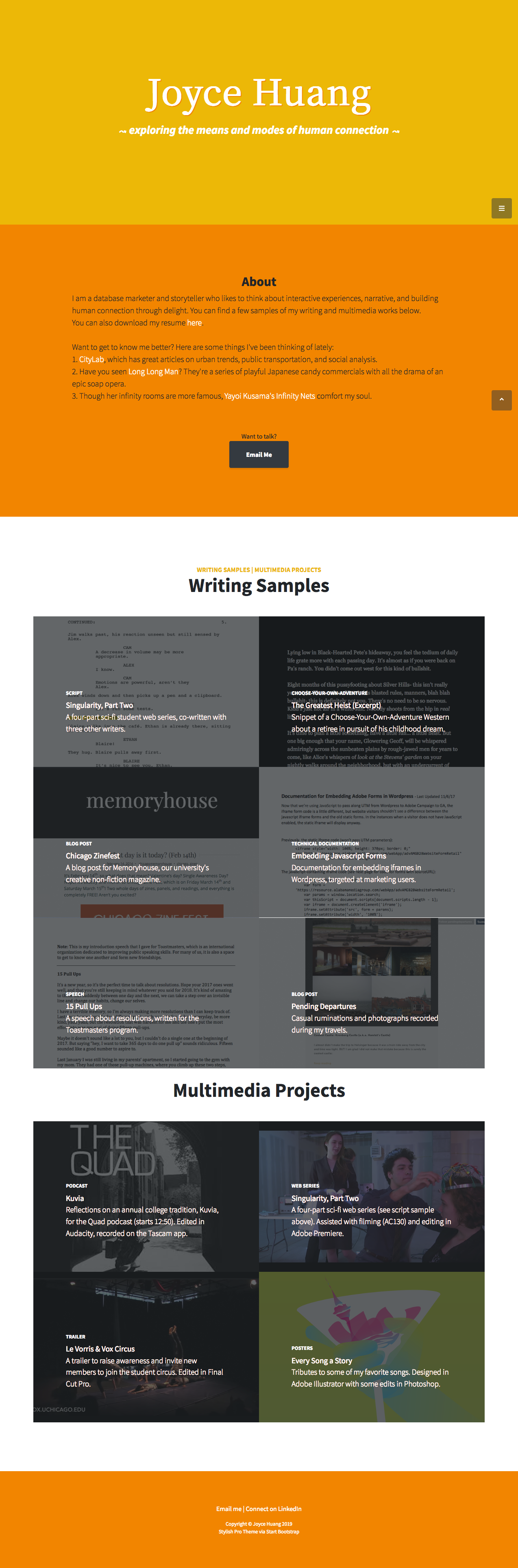
Then I began to seriously apply for writing jobs. For version 2, I found a template from Start Bootstrap and customized it. Once I finished loading on the content, I was inspired by Don't Make Me Think and asked friends to do a quick and dirty usability test of the site. Thanks to their feedback, I found major flaws with the original color scheme, the scrolling process, not to mention copyedits.
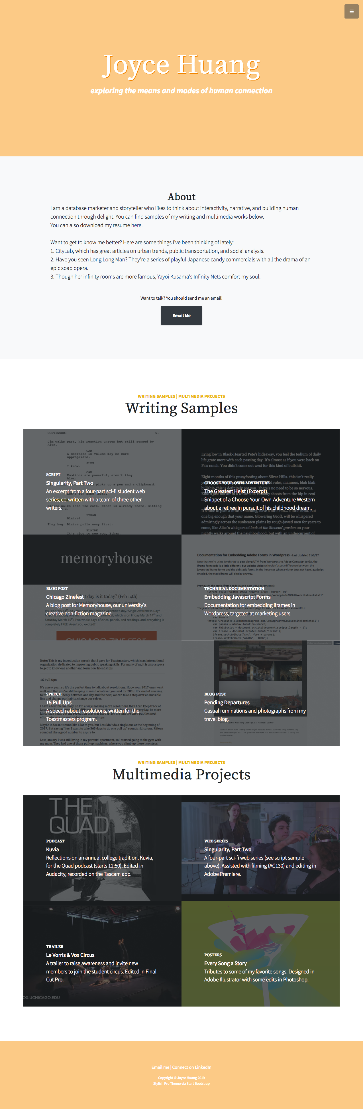
I was content with the updated site for some time, while keeping a wishlist of fixes, until I started school and realized there were underlying accessibility and usability flaws. My colors were not just boring, they were hard to read because the color contrast was bad! The hierarchy of headings could be confusing! Links should be distinct from text, and also color should not be the only way to orient yourself on the site. And then there was all the problematic tangles of my haphazard coding...
Some of these were easy fixes, but major changes to the template proved to be very time consuming, so I decided to return back to a simplified site before I drove myself crazy trying to edit bootstrap.
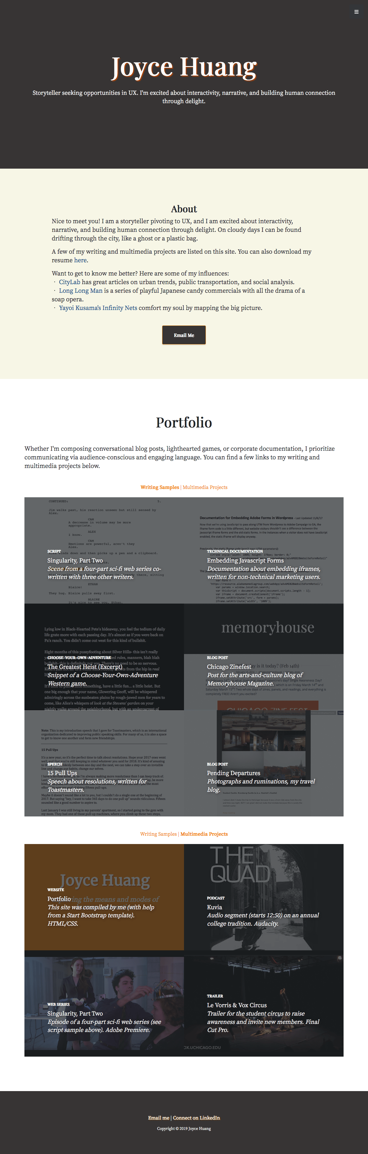
So it was time for... version 3! The focus has shifted from writing to UX, and so I took some inspiration from other portfolios in the field. I really admired how stylish the minimalist portfolios look, but at the same time I struggled to make it something that fit me. Being preoccupied with accessibility, it was extremely functional, but the more I looked at it, the more its aesthetics looked like a grey uniform that didn't really fit me very well...
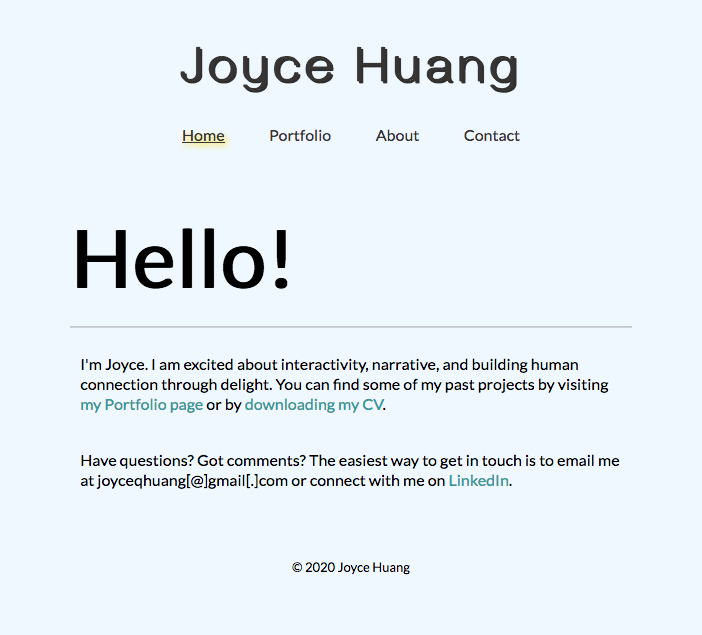
So I thought of doing another redesign, which is the site you see today. Coded by hand by yours truly, with a lot of help from Google.
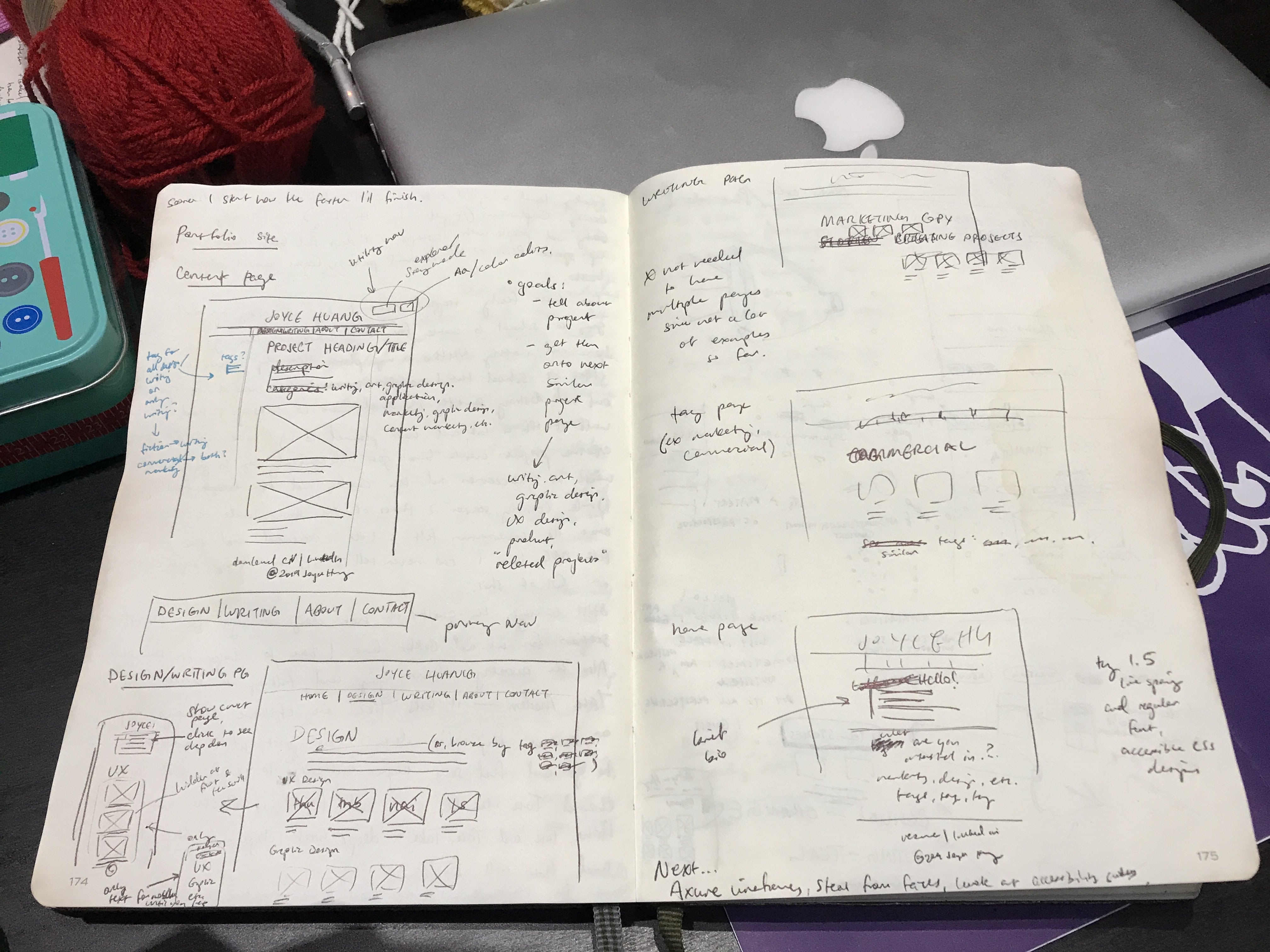
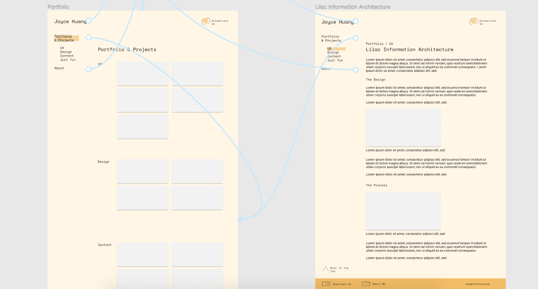
First I prototyped in Figma to get an idea of how things should fit together—I prefer to sketch and experiment before I commit. Plus, the prototype becomes a roadmap of features to add. For example, there's an animation toggle in these prototypes, but I haven't gotten around to adding in the animations that I envisioned, so instead I've substituted a doodle in the meantime to add balance and visual interest.
It's very much still a work in progress! The most recent major update to this site was reworking the site's information architecture after I got feedback from multiple people re:the homepage being redundant. Now the site opens onto the portfolio automatically; maybe when I finally set up my welcome animation and/or game, I can bring it back someday.
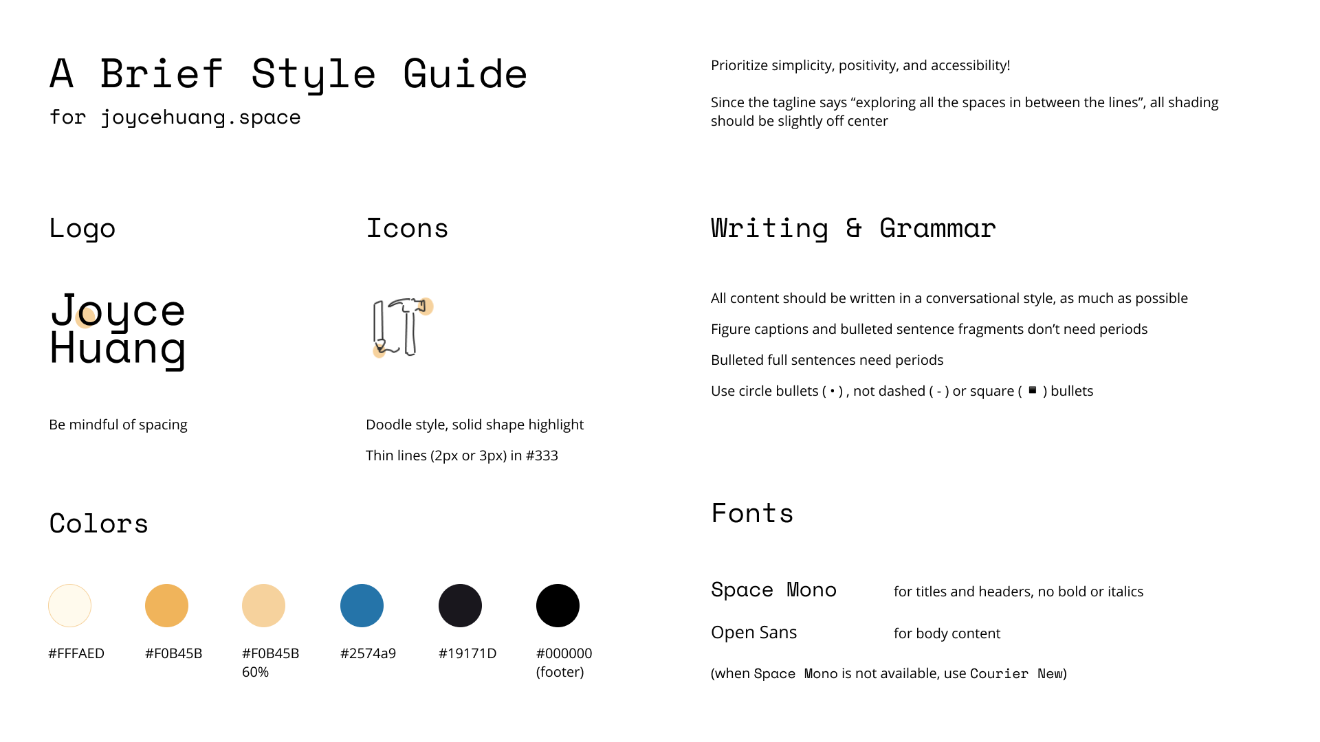
And to keep track of everything, I've made a style guide so present me and future me can collaborate! (Inspired by the style guide template from Elementor, the Barbican's interactive brand guidelines, and Skype's brandbook.)
Current challenge
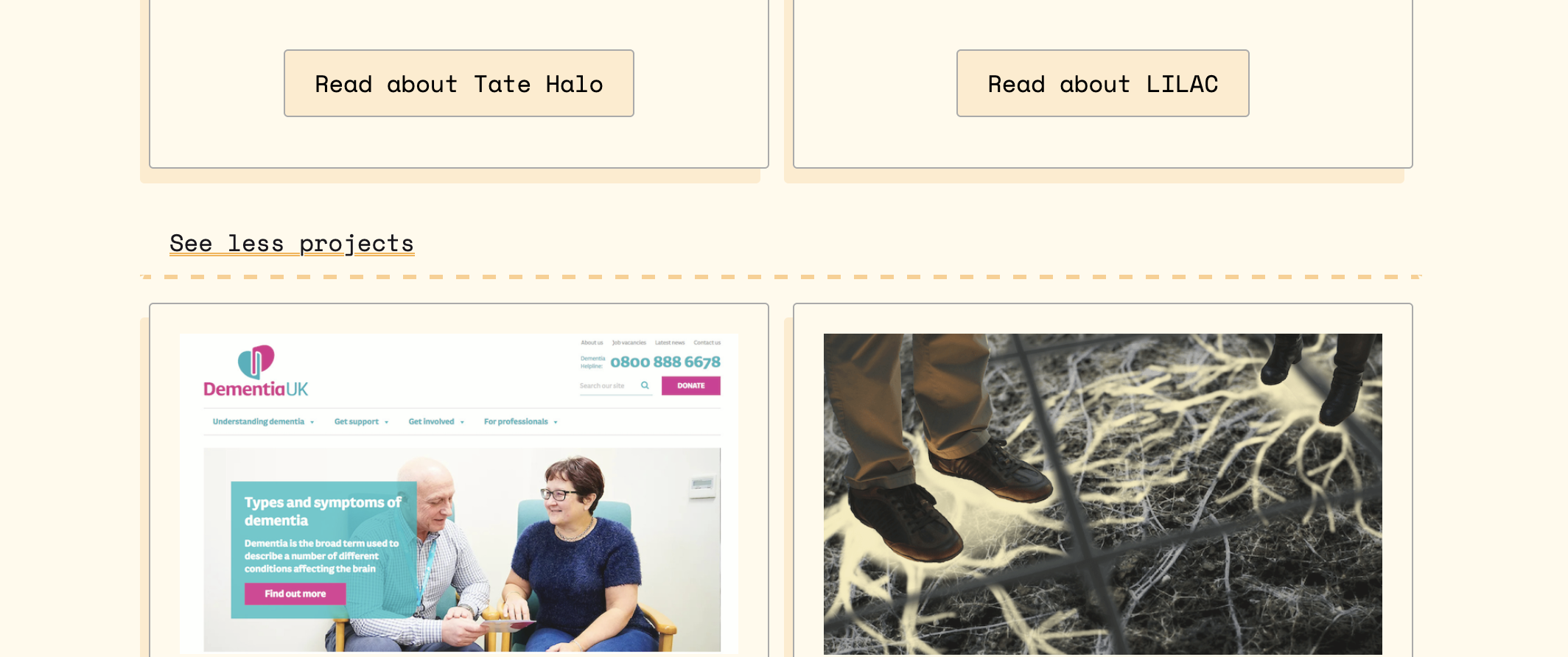
As I keep iterating, you might see some things appear and disappear on this site. My current problem is that I have limited myself to four projects per category out of worry that this site was getting overwhelming to browse. But I still think about how to link to more projects that may be of interest to you, so I might swing back around to using accordions...
My worst fear is that you'll read this and think "this lady can't design her way out of a paper bag" but people say you should do things that scare you. If you've read up to this point, let's be honest with each other, why don't we?