Tate Halo
interview, observation, affinity mapping, ideation, survey
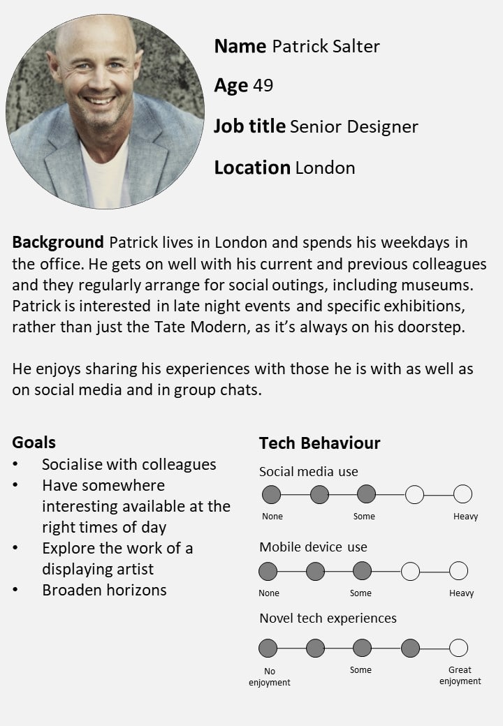
Context
Goal: Design a digital interactive technology that encourages Tate Modern visitors to "leave a trace".
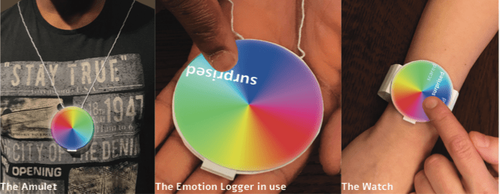
Outcome: A design for an interactive digital experience, using wearable emotion loggers, kiosks, and projections.
My role: Our team of four worked very closely, so it is difficult to divide contributions distinctly, but I helped...
- Conduct direct observations, user interviews, desk research, and desirability surveys
- Ideate concepts during Crazy 8's, create user journeys, and wireframe the kiosk screens
- Conduct qualitative user testing to evaluate our design and organized insights into a rainbow spreadsheet
Too much to read? You can download a PDF summary of the project.
Just the deets, please!Process
The initial brief challenged us to design a way for visitors to "leave a trace", so we needed to understand the Tate Modern's visitors and how they were already interacting with the museum. What did they do? How did they interact with the art? What were they interested in?
We did:
- 8 hours of direct observations within transitional spaces of the museum over a spread of weekdays and weekends
- 7 in-depth interviews with a convenience sample of people who have visited the Tate Modern within the last 3 months to understand the behaviors that we were seeing (and not seeing) during observations
- Lots of desk research about interactive exhibits, the Tate Modern's space, and technologies
Patterns emerged when we coded our findings and dumped our data into virtual affinity diagrams on Miro.
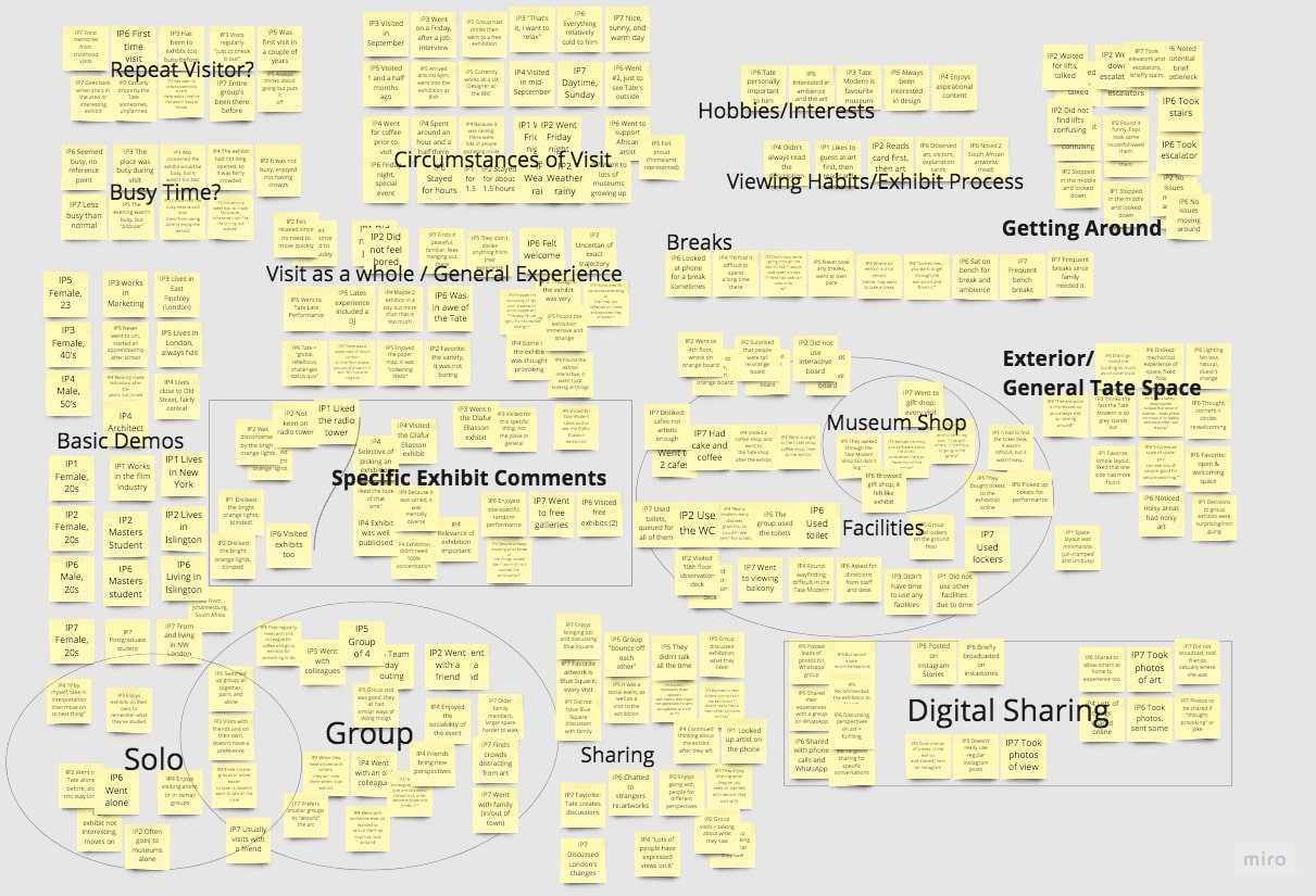
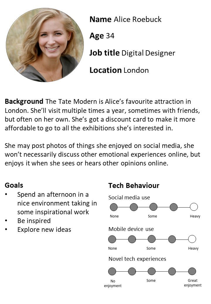
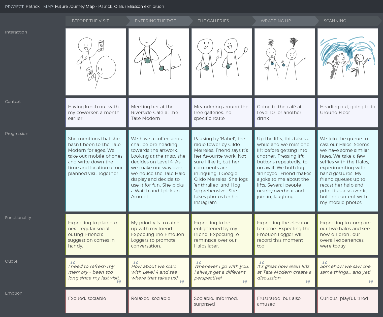
From these, we synthesized the Solo Visitor (our primary persona) and the Social Visitor (our secondary persona), both of whom desired to share their experience of the museum but had different behaviors. To better understand their behavior, we created user journeys to put them into context.
Based on our understanding of the museum visitor from our research, we established design goals to be addressed:
- How might we allow visitors to share their reactions with others? (Key goal)
- How might we provide a unique takeaway for each guest, either physically or digitally?
- How might we make our interactive technology stand out?
- How might we make our design relevant to all visitors and unique to the Tate Modern? (Bonus)
Throughout the process, we had developed an inspiration board and collected desk research. With these materials in mind, and our persona and user research, our team used Crazy Eights to sketch out concepts, which resulted in about 28 total concepts. Two of these ideas were then selected through dot voting to be further refined: (1) a halo visualization for visitors to display and communicate their emotions, and (2) a system of handcrank for visitors to generate electricity depending on their reaction to the art.
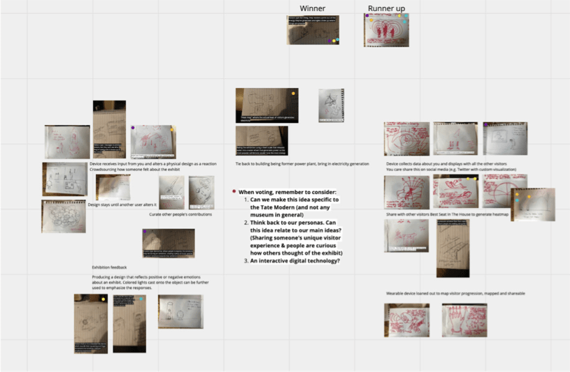
We then split into two teams to further develop these ideas. The handcrank idea was discarded because it fell short of our design goals upon further exploration, so that team proposed an alternate version of the halo idea—thus the two concepts were either a wall display halo or a wearable halo, both of which allowed visitors to interact with their data after collection.
Desirability surveys involving storyboards, demographic questions, concept-related questions, and the Microsoft product reaction cards were used to test real visitors' impressions of one or the other of these concepts. These were conducted through guerilla research in the galleries. (Here is a copy of the survey if you want to check it out.)
From 13 responses, we found the appeal of both ideas: immersively interacting with data and having a memento of the visit. We ultimately combined both into final concept, the Tate Halo.
Design
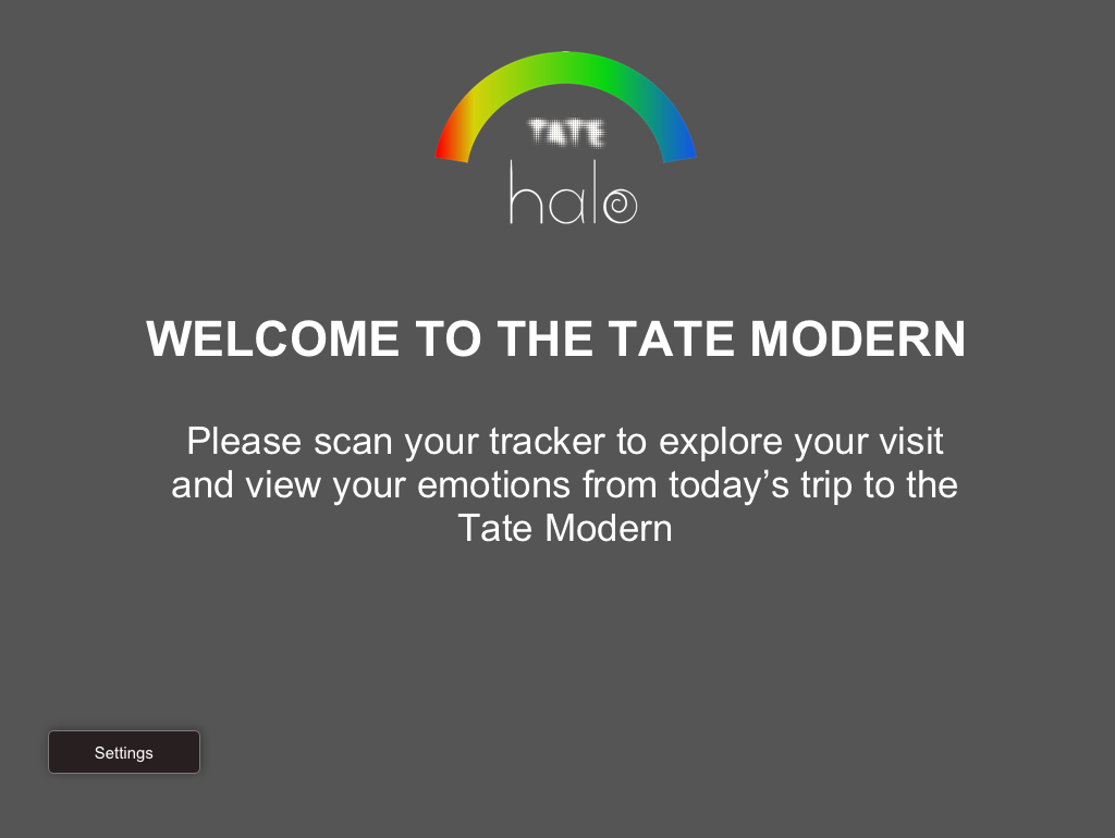
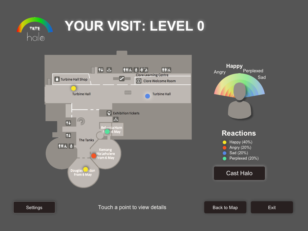
Modern art invites interpretation and reflection, so each person's visit to the Tate Modern is unique. Our team of four discovered that visitors wanted to share their unique experience, so we envisioned a technology for visitors to record their emotional responses within the gallery and use their data to spark conversations online and offline.
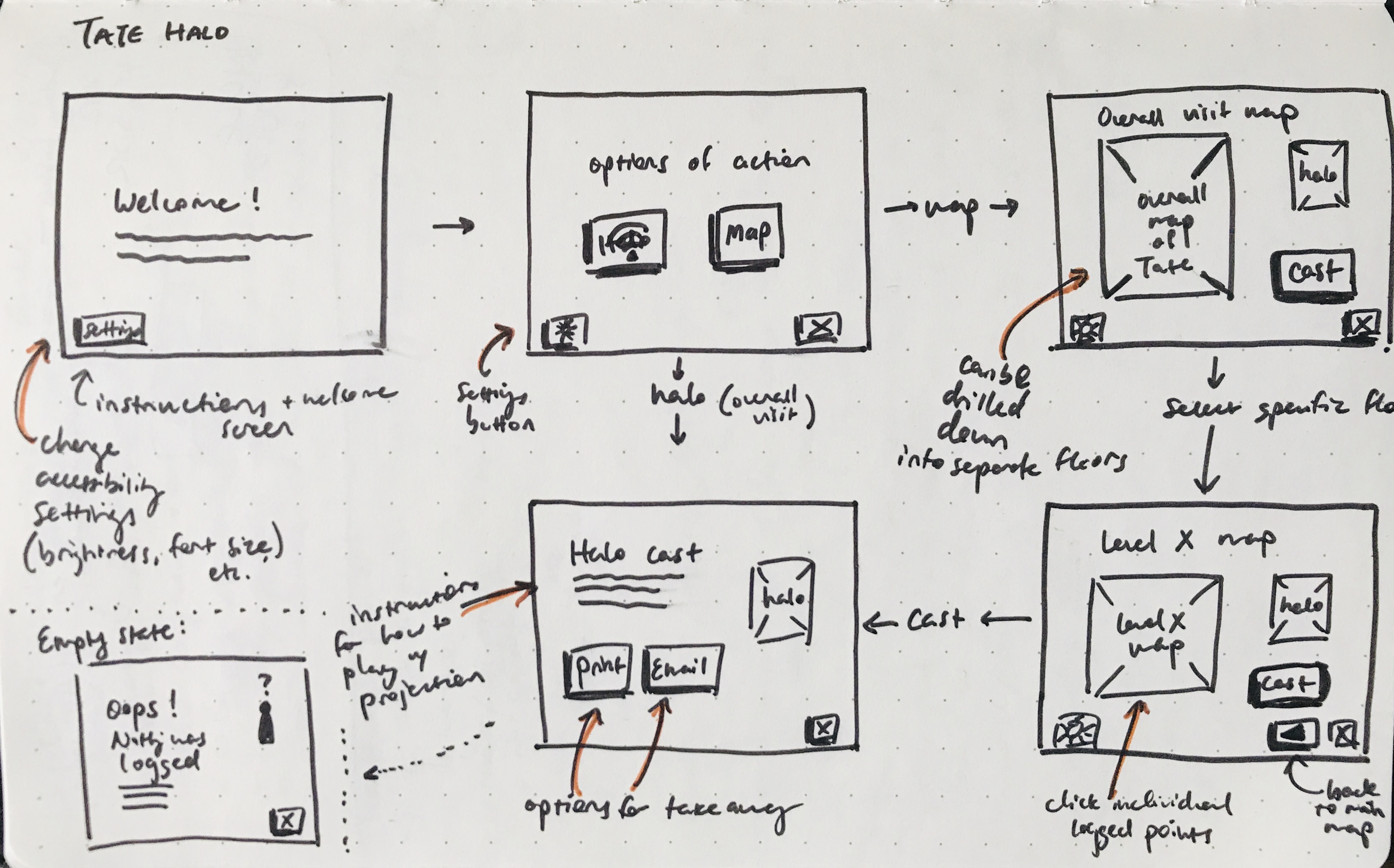
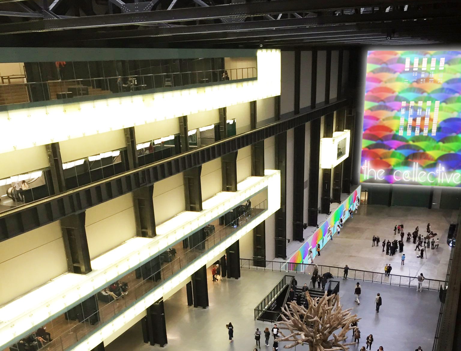
The data would be synthesized into a color-coded Halo that summarized their emotional journey, which could then be projected to be compared with friends side-by-side, exported to be used in digital conversations, or juxtaposed with projections from other visitors of the day. Mid-fi wireframes were created to help user testing participants better visualize what the screen might look like in real life.
Evaluation
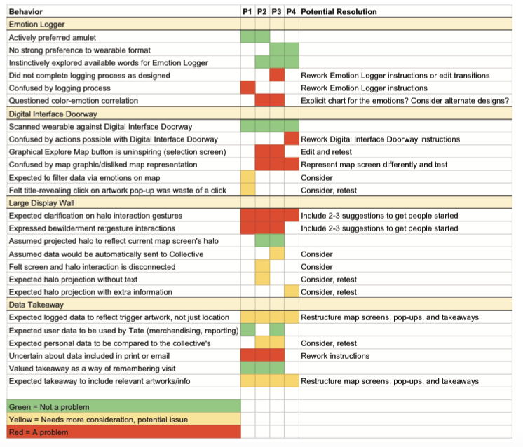
After creating prototypes of the wearable devices and screens, and a mockup of the wall (see above), we conducted a quick round of 4 evaluations in order to provide the basis for future improvements. The results of these were combined and deduped into a spreadsheet for easy communication of improvement recommendations, potential future considerations, and positive comments.